


Welcome to the Monitorix project
Take control over your small server
News
06-Apr-2010
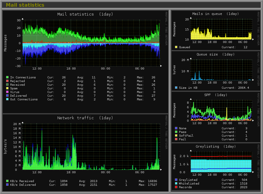
This new version introduces a new major feature; a complete MTA statistics graph. The internal layout of this new graph follows the standard Monitorix model with a central graph on the left and two smaller graphs on the right.The graph on the left shows the pure MTA statistics inspired by the Bambang Budiharto's graph showing the incoming connections on SMTP port, the connections rejected, the mails received, the mails marked as spam and as virus, and finally the mails delivered and the outgoing connections.
The small graph in the top right corner has two possible modes. The default mode shows the current mail queue, while the alternate mode shows the network traffic used by the MTA. This network traffic is almost the same one that appears in the SMTP network port traffic graph except that the data is collected directly from the MTA instead of using iptables (on GNU/Linux systems).
Finally the third graph shows the statistic values of the Greylisting shielding method.
This graph is created parsing statistics values from:
and these are the only supported right now.
This new version also comes with some bugs fixed and support for those 'multilines' in the sensors command.
Check the Changelog for all the details.
IMPORTANT NOTICE: The configuration file monitorix.conf has been extended with important changes.


